We are now a Big Commerce Certified Partner!

 
Partner-Certified-Wordmark.png
 

One Time Creative has worked with many clients looking to start a new ecommerce store, or upgrade an existing one. There are lots of ecommerce platforms to choose from, but one of the most common questions we hear, is which will give us the flexibility to change as the business grows. How you set up and run your shop now, may be very different to how you run it in a couple of years and the last thing you want to do is transfer everything to a new platform if you find the current one can not support your new requirements.

This is why we have undergone the training and have now become a certified Big Commerce Partner, as we believe this could be the solution for many clients. We will always look at all the options and give you the pros and cons for each platform, as there is no one solution for all. However, there are some major advantages that we have found by using Big Commerce:

  • No transaction fees - there is a monthly or yearly fee so you can budget your expenditure

  • No restrictions on payment gateways, you use the one you want

  • Unlimited products, file storage and bandwidth

  • Built in features including abandoned cart recovery, gift cards, discounts, product reviews

  • Multi currency

  • Different pricing for wholesale customers

  • Sales channels to eBay, Amazon, Google Shopping, Facebook

These are just some of the highlights we believe make Big Commerce stand out from the others and enable your shop to grow as your business does.

If you would like further information on Big Commerce or to discuss your plans for an ecommerce website, please do not hesitate to contact us.

Converting to Online Orders

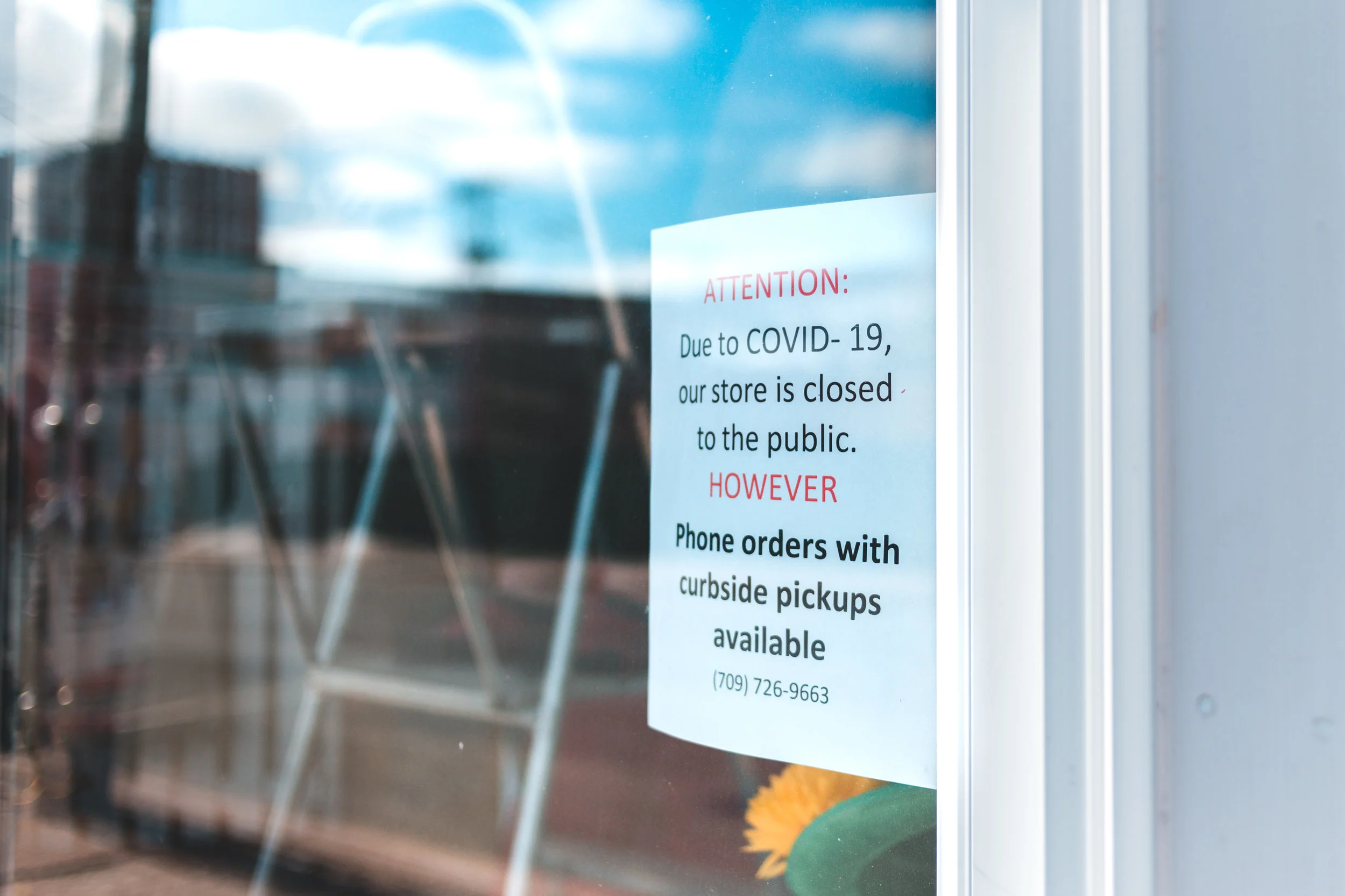
With local lock downs and strict regulations for retail stores due to COVID-19, online shopping is becoming an even more popular method to buy everyday items. E-commerce sites enable you to keep your business trading, while gaining exposure to a whole new potential customer base.

At One Time Creative, we are here to help you get set up in the world of e-commerce. In just a few days, you could be emailing your existing customers with the great news that they can keep buying from you without having to leave their home.

So, what do you need to do? Contact us so we can discuss your requirements. With this information, we can provide you with a full breakdown of recommendations to set up your online shop. This will include details of the design package we will use to create the shop, the payment gateway to use, how the shop can integrate with any existing website you have and how we recommend promoting the shop when it goes live.

During these difficult times, we know that any expenditure needs a lot of consideration before proceeding. Because of this, we have lowered our design fees and are happy to discuss payment plans if this would be helpful. Our aim is to help more businesses trade through this period and an online shop just might be the answer for you.

Please contact us for more information on e-commerce sites or any other service we can support you with.

Expanding the brochure range

skibo.jpg

We have been working with Stellex Manufacturing for over 2 years, helping to expand the brand and bring in new customers. In 2018 we launched their first corporate brochure that focused on case studies of their work and promoted their design expertise and exceptional standard of quality. Since then, this brochure has expanded to become a 32 page vital tool for their sales and marketing teams. It is sent to potential new customers and used when visiting existing clients or promoting the brand at trade shows.

The success of the case studies brochure has led on to the design of two new Stellex brochures. The first promotes their distressed and shop-fitting range, with a target audience of distributors within the trade. The second highlights their outstanding work in animal welfare and the recently completed projects with Battersea Dogs and Cats Home.

When designing corporate brochures we are looking to get readers from not just the physical editions that are printed. Each brochure we design is converted in to a digital ‘Flipbook’, with a link that can then be shared online, or added to a website. This useful tool expands on the reach of your marketing and helps reduce the cost of printing (helping save on your environmental footprint as well).

If you would like further information on corporate brochure design, please contact us.

To view the Stellex range of brochures please click on the following buttons.

Discounts Offered to Charities

friends-1149841_1920.jpg

One Time Creative is committed to helping charities with their website and print media design needs. With extensive experience of animal welfare organisations, we are uniquely positioned to understand the needs of charities and how best to promote them in a crowded environment.

We are delighted to announce a new partnership with the Association of Dogs and Cats Homes (ADCH) where we are offering substantial discounts on our services for their members. Discounts include:

  • 30% DISCOUNT ON WEBSITE DESIGN, INCLUDING FREE SEO

  • 30% DISCOUNT ON OUR WEBSITE SUPPORT PACKAGE

  • 10% DISCOUNT ON PRINT MEDIA DESIGN

  • FREE CONSULTATION

For full details on this offer or to contact us about our services, please CLICK HERE

Three floors, four bars, one website

Three Lamps is a brand new bar and restaurant in the heart of Swansea. A full refurbishment has taken place over the past year and the owner and team have created a spectacular venue unlike anything else in the city. Spread over 3 floors, the Three Lamps consists of a traditional bar and restaurant on the ground floor, a micro brewery and live music bar on the second floor and a roof top terrace bar on the third floor. This incredible venue needed an incredible website and One Time Creative was delighted to be chosen to complete the job.

The main task was to ensure the website catered for multiple audiences that would be visiting the establishment. It was vitally important that the homepage would be attractive for a family looking for a restaurant, as it would be for a group of friends looking for a night out. On top of this we also had audience groups including city shoppers wanting a coffee, students looking for live music and party groups of all ages wanting to book different bar locations.

The homepage was designed to use images that would be attractive for the main audience groups and multiple button options to lead people off to the areas of interest. A header menu bar was created with simple options of Food, Drink and Music, with sub-menus under each heading. All of this combined ensures visitors quickly and easily obtain the information they need, while also getting a good feel of what the Three Lamps offers.

Further pages will soon be added to the website including an interesting write-up on the history of the building, which was regularly visited by writer and poet Dylan Thomas and then later bombed during the second world war.

We are delighted with the end result for this website and look forward to working with the Three Lamps over the coming months and years to promote this incredible venue.

Supporting a global brand with a new website

W&H is a family run company based in Austria, that has been in operation for over 125 years. They are a leading manufacturer of dental instruments and equipment and known for their quality and innovation.

Well established in the human dentistry market in the UK, W&H are now looking to expand in to the veterinary marketplace and so required a new website and brochure to launch the brand.

Working with existing brand guidelines, that were tweaked for veterinary customers, we created a new website to promote the products available and the services W&H provide. Each product page links to product brochures and promotional videos, where available and includes testimonials from existing veterinary clients.

A blogging page has been added for latest news and offers to be posted and a contact sign up form is added on several pages, to encourage new customers to obtain news and information direct to their inboxes.

A product brochure will be launched in early 2019 using a similar design style to the website and helping enforce the W&H brand within the veterinary sector.

Launching a new charity

W&W Tiger.JPG

Wildlife & Welfare is a new charity with a team of experienced professionals coming together for a single aim: to support charitable organisations around the world, to help them achieve more. By providing free resources and access to a volunteer network that can help with anything from marketing and fundraising, to animal welfare standards and the latest conservation methods, Wildlife & Welfare is a new lifeline in the charity sector.

One Time Creative was delighted to offer it’s support to this new organisation by providing a complimentary design service for a logo and website.

W&W Logo V2 colours 2.jpg

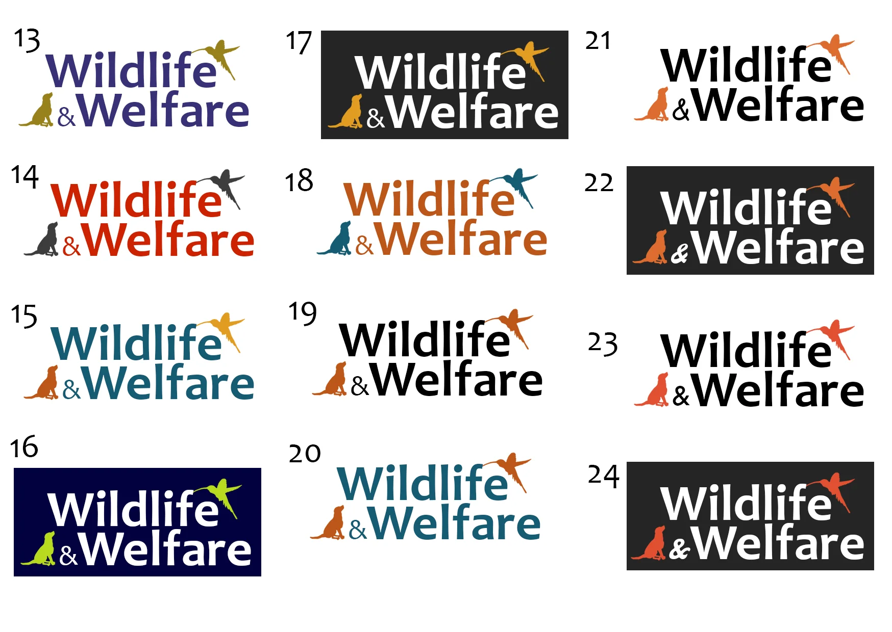
Stage one was to research existing charity logos and understand from the Wildlife & Welfare team, their ideas behind the charity brand and image. It was important to not focus on a specific area of the charities work, so equal weighting should be applied to both domestic animals and wildlife. Brand colours were also very important to help distinguish from other charities, while also ensuring they are bold when being advertised and when promoted on clothing by staff and volunteers on projects. After reviewing a range of logo designs and colours, a clear favourite emerged that ticked all the boxes.

The next stage was the website. As with all websites, it is important to identify who the audience is. With Wildlife & Welfare, it was clear the website had to cater for many different audiences from the traditional charity supporter to employees of charities looking for resources to help them. The homepage therefore had to easily point people to the different areas of interest and still explain who the charity was for new visitors.

The website also had to include a resource library with a search facility and a payment gateway to be linked up, allowing for online single and monthly donations.

We are really pleased with the finished website and excited to be updating it with new content over the coming months, including an online shop and gallery page with images from the charity projects all over the world.

New content for Stellex website

Stellex web 4.JPG

Continuing on from the corporate brochure and product data sheets already designed for the manufacturing company Stellex, we have now completed a website overhaul, providing new content and an update to the existing design.

Our work included the addition of 36 product pages and 14 case study pages. Visitors to the site can now easily see the full range of products available and can read/view amazing examples on how these products have been used in places from Chatsworth House, to the University of Glasgow.

Eve Harlow Acupuncture

Eve 1.JPG

Eve Harlow runs a small acupuncture centre in South Wales and required a website to promote her business and educate visitors on the benefits the treatment can provide.

Using stunning images from the Gower Peninsula, which were taken by Eve, we created a website that has a local feel and a calming quality to it.

This website is a great example of how One Time Creative can design websites for businesses of all sizes and with varying budgets.

A fresh look for Harmonie International

Harm 1.JPG

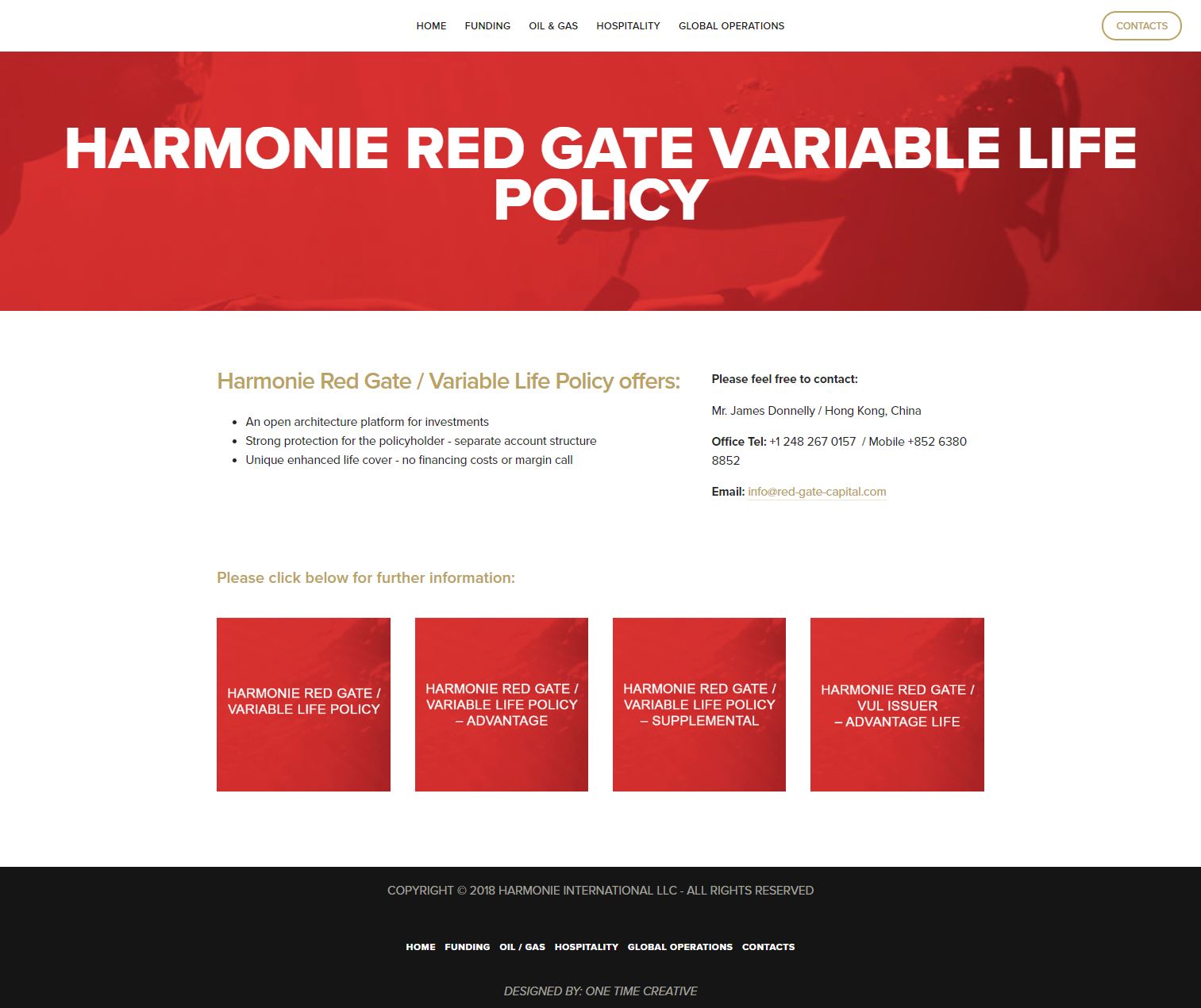
Harmonie International is a global business with operations ranging from oil wells to financial policies. Their existing website struggled to direct visitors to the relevant pages effectively, so they contacted One Time Creative for help.

It was important to breakdown the business in to relevant headings, which could then be used as the main navigation on the website. Unlike other websites where you have an overview of the business on the homepage, it was decided that Harmonie International would have a much more simplistic style, using images and titles to guide visitors to the correct pages.

One Time Creative is working with Harmonie International to design new websites for some of their subsidiary companies including Harley's Bar and Sea Vodka.